South Sub Church
My most recent client is South Sub Church in Littleton, Colorado! They been commissioning me to help with their sermon series graphics which have a variety of topics and therefore need different imagery to reflect the sermon. It’s been a lot of fun exploring how to convey what the pastor is preaching through design.
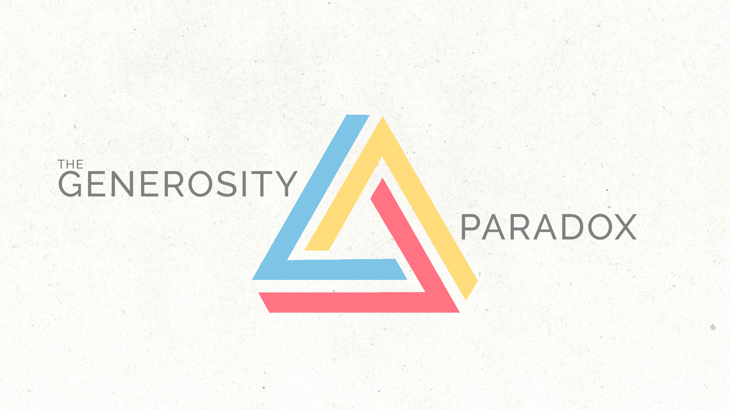
The Generosity Paradox
This series was covering the paradoxical idea of generosity with an emphasis on 2 Corinthians 9:11 - God gives us gifts, with the gifts he gives us we are to be generous, show gratitude and give Him glory.
Since this was a parable based series they were looking for something more whimsical and colorful than anything dark and dreary. I was given the image of the impossible triangle to go off of and pretty much ran with it leading to the options below filled with impossible shapes.


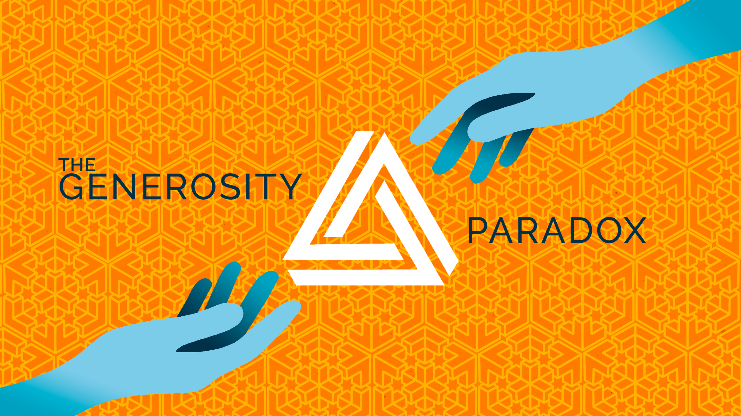
The church decided to go with the image with the hands reaching outwards each other but they were looking for a different color scheme. That led to the creation of these color variants!


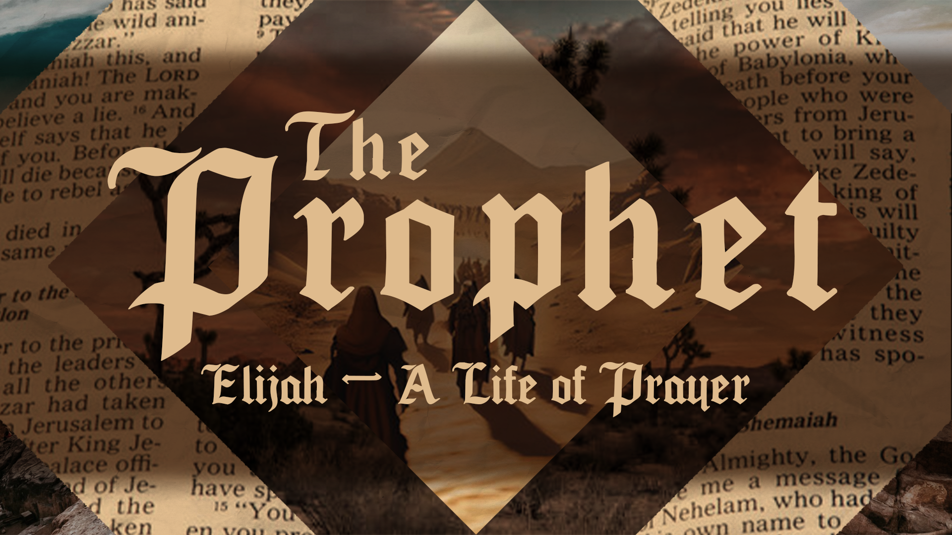
The Prophets Series
One of the best parts about my job is when a client really lets me loose to explore whatever design inspiration may strike me at the time or what I deem to be the most legible in terms of both typography and image readability.
Originally, they wanted more of a movie poster vibe while also allowing it to be a more neutral design so that it could carry over for when they want to cover prophets besides Elijah. Below are the 5 starting iterations that came from that.


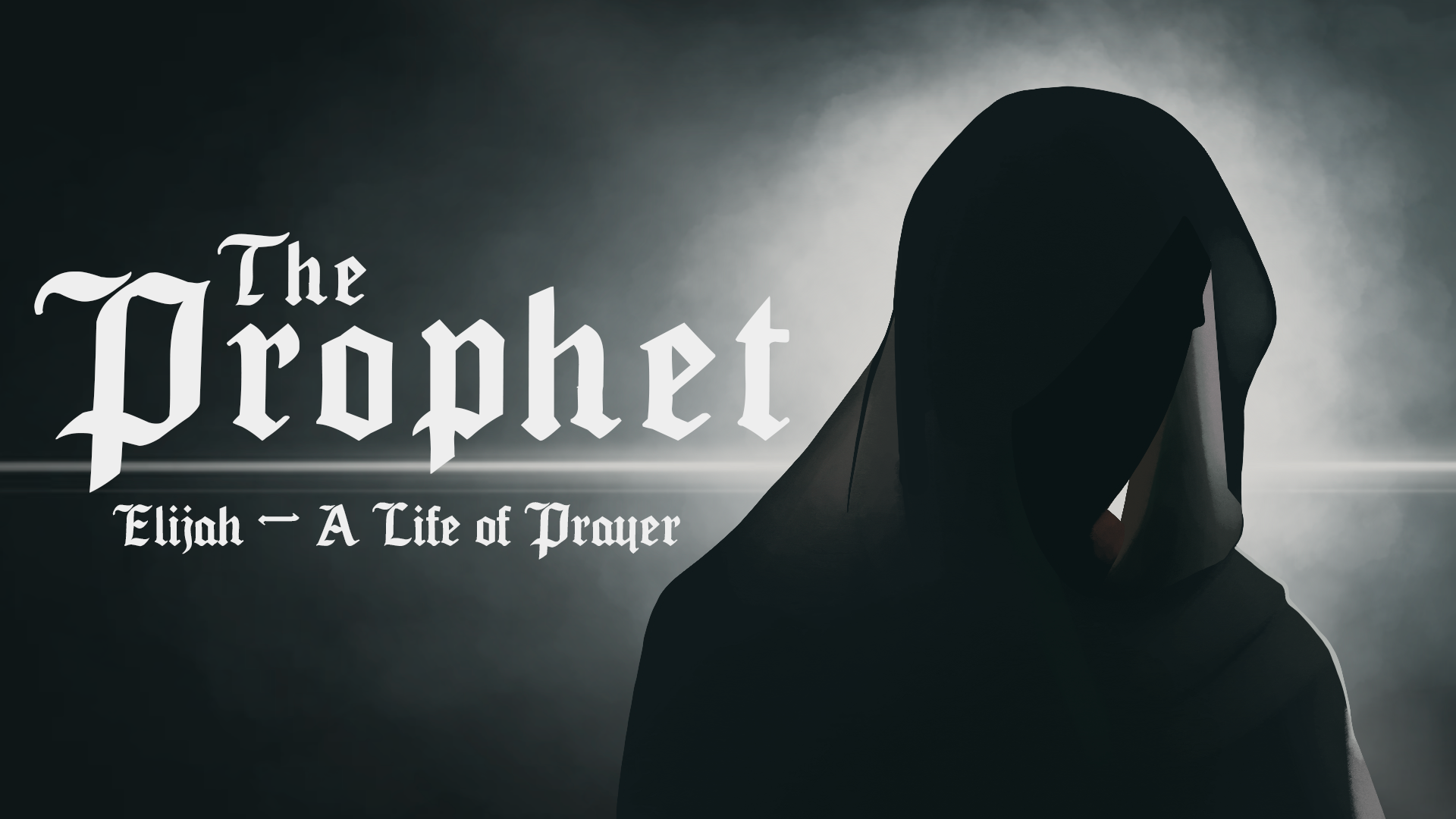
What we ended up doing was combining the imagery from the first image with the typography of the second!